UX Design for Mobile Apps: Increase App Valuation

You’re probably in one of two situations right now.
Either you have a strong app idea and a rough product already taking shape, but users keep dropping off because the experience feels clumsy. Or you are about to fund your first serious build, and you’re trying to avoid the classic founder mistake of treating UX as a cosmetic layer you can “polish later.”
That mistake gets expensive fast.
For a startup, ux design for mobile apps is not decoration. It is part of the product architecture. It affects retention, trust, conversion, support burden, roadmap complexity, and how your company looks during technical due diligence. A mobile app with confusing flows, weak feedback, poor ergonomics, and slow interactions does not just lose users. It signals weak product judgment and weak engineering discipline.
Investors notice that. Users notice it first.
Why Mobile UX Design Determines Startup Valuation
A founder can have a sharp market insight, a credible go-to-market plan, and still lose the room because the app feels frustrating in the first minute.
I see this often. The team builds “enough” to demo. Screens exist. Features technically work. But core actions take too many taps, navigation feels improvised, forms punish mistakes, and the app behaves like a prototype instead of an asset. Users leave before the business model gets a chance to work.
That is not a design problem in isolation. It is a valuation problem.
UX is a business multiplier
The market tells you how seriously companies now treat experience. The global UX design market was valued at $6,120.44 million in 2021 and is projected to reach $20,058 million by 2028, with a 16.24% CAGR according to Cizotech’s mobile UI and UX statistics roundup. The same source notes that investing $1 in UX can yield up to $100 in ROI, and good UX can boost conversion rates by as much as 400%.
Those numbers matter because early-stage valuation is built on belief in future efficiency. If your product converts better, retains better, and scales with less rework, your technical asset is worth more.
Your app is judged before your pitch deck is
On mobile, users form their opinion quickly. They are not patient, and they should not be. If your product makes them think too hard, wait too long, or recover from too many avoidable errors, they assume the company is immature.
A polished mobile experience sends the opposite signal:
This team understands users
This codebase was built with intent
This product can support growth without a redesign-and-rebuild crisis
This founder makes disciplined product decisions
A founder should treat mobile UX the same way they treat security, data integrity, and infrastructure. It belongs in the first build, not the cleanup phase.
Investors read UX as operational competence
A good investor does not separate UX from engineering quality. They know bad UX often sits on top of vague requirements, inconsistent components, weak state handling, and rushed implementation. They also know strong UX usually reflects tighter product thinking, cleaner systems, and better execution discipline.
That is why I push founders to stop asking, “How do we make it look better?” and start asking better questions:
Does this flow reduce cognitive load?
Does the interface support repeat use?
Will this pattern still hold up after feature expansion?
Are we building a habit-forming product or a disposable demo?
If your mobile app is your primary customer touchpoint, UX design is part of your cap table story. Build it that way.
The Pillars of an Investable Mobile Experience
Most founders hear “good UX” and think color palette, screen polish, and maybe a smoother onboarding flow. That definition is too shallow for a startup.
An investable mobile experience has to do five things at once. It must help users move confidently, respond instantly, feel coherent, solve a real problem, and remain usable for a broad range of people. If even one pillar is weak, the product starts leaking trust.
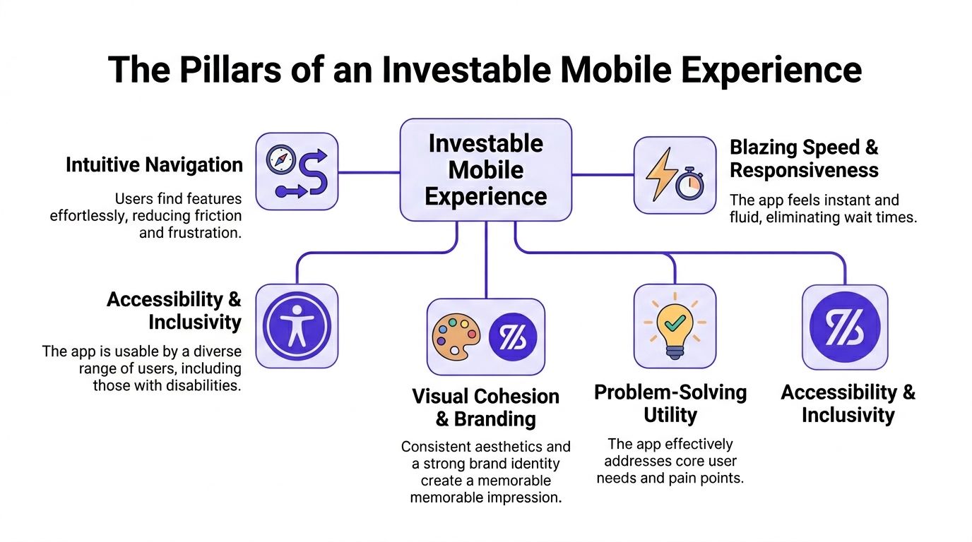
Intuitive navigation
Navigation is your product’s hallway system. If users keep opening the wrong doors, your feature set does not matter.
People should know where to tap next without stopping to decode the interface. Labels should be literal. Screen hierarchy should be predictable. Back behavior should feel obvious. If users need to “learn” your navigation, your app is taxing them.
User perception is critical, as first impressions are 94% design-related, and a bad mobile experience causes 88% of users to never return, according to Maze’s UX statistics.
Blazing speed and responsiveness
Mobile UX is partly visual and heavily temporal. The product has to acknowledge every action with immediate, meaningful feedback.
A button tap should feel accepted. A submission should show progress. A list should not freeze while fetching data. Speed is not just an engineering KPI. It is emotional reassurance.
When the interface feels laggy, users stop trusting the app. They retry actions, abandon steps, and doubt the company behind the product.
If a user is ever wondering whether your app registered their tap, your UX is already failing.
Visual cohesion and branding
Brand consistency is not vanity. It reduces decision friction.
If your spacing changes from screen to screen, button styles shift, and typography lacks hierarchy, users subconsciously read the product as unstable. Consistency tells them the product is under control. That matters in fintech, health, logistics, B2B SaaS, and every product where trust carries commercial value.
A simple way to pressure-test this is to review your top ten screens side by side. If they look like they were designed by different teams, your interface needs a system, not more styling.
For founders building in Flutter, a practical reference on Flutter UI/UX Design best practices is useful because it connects visual consistency to implementation choices your team will make.
Problem-solving utility
A pretty app that does not remove friction from a real job is noise.
Every screen should answer one question: what user problem gets solved here? If a screen exists mainly because the team thought it “might be useful later,” cut it. MVP UX gets stronger when you remove speculative flows.
I advise founders to map every primary screen to one of three jobs:
Get started
Complete a core task
Resolve a blocker
If a screen fits none of the three, it probably does not belong in version one.
For a stronger product planning lens, Buttercloud’s article on product design for startups is a solid internal reference for aligning feature decisions with business value.
Accessibility and inclusivity
Accessibility is not a compliance afterthought. It is product quality.
Text should remain readable, touch areas should be forgiving, motion should not disorient, and flows should not depend on one narrow type of user behavior. Teams that ignore accessibility usually also ignore edge cases, recovery states, and clarity. That spills into broader UX weakness.
Maze also notes that 77% of brands view UX as a key differentiator, and 52% of consumers have abandoned a purchase due to a bad mobile experience. Accessibility belongs inside that commercial reality, not outside it.
Navigating Native UX iOS vs Android Patterns
One of the fastest ways to make your app feel amateur is to build one generic interface and ship it to both iOS and Android unchanged.
Users do not consciously say, “This violates platform convention.” They just feel friction. The app feels foreign. Trust drops.
If you are building native, respect native behavior. If you are building cross-platform, still respect native behavior.
Where founders usually get this wrong
They approve a design in Figma that looks clean in a static review, then discover during testing that the app feels slightly wrong everywhere. iOS users expect one set of interaction cues. Android users expect another. Copying one platform onto the other creates subtle resistance in every journey.
That resistance compounds.
Here is the practical comparison founders should know:
| UX area | iOS expectation | Android expectation |
|---|---|
| Navigation | Bottom tabs and stacked navigation feel natural | Bottom navigation works, but broader Material patterns also shape expectations | | Controls | Tighter, lighter visual treatment | More explicit state cues and Material behavior patterns | | Dialogs | Minimal interruption and clear action hierarchy | Action presentation often feels more system-forward | | Gestures | Swipe-based interactions are very familiar | Gesture usage varies more by device and implementation |
The point is not to memorize platform doctrine. The point is to stop forcing symmetry where it hurts usability.
Thumb reach is not optional
Many design teams still fail on this point.
The bottom 20 to 30% of the screen is the thumb-friendly green zone for primary actions, according to Glassbox’s mobile app UX design best practices. Put your highest-frequency actions there. Do not bury them at the top because the mockup “looks balanced.”
Glassbox also notes that touch targets smaller than 48x48dp in hard-to-reach red zones can cause 2.5 times more rage clicks and a 22% session abandonment rate.
That is not a visual nitpick. That is direct friction in core task completion.
Put primary actions where the thumb already wants to go. Do not ask the user to stretch for your design preferences.
Practical decisions I would push in a founder review
If I’m reviewing your app before build, I’m looking for these calls:
Primary actions low on screen: Checkout, save, continue, search, and compose actions should sit in reachable zones.
Platform-respectful back behavior: Do not improvise this. Users rely on muscle memory.
Controls that look native enough: Custom styling is fine. Breaking expected behavior is not.
One-handed task completion: If your app requires two hands for common flows, fix the flow.
A strong primer on the broader build implications sits in Buttercloud’s piece on native app development, especially if you are deciding how far to lean into platform-specific UX.
My rule for founders
Customize branding. Do not customize ergonomics beyond recognition.
Your competitive edge is not inventing a new button behavior. Your edge is making the product easier to use than competitors while still feeling familiar on the device in someone’s hand.
Performance as a UX Feature Your Investors Will Notice
Founders often split product quality into two buckets. Design handles experience. Engineering handles speed.
That split is wrong.
Performance is UX.
If your app loads slowly, hesitates between states, or stutters during simple interactions, users do not care whether the issue came from frontend code, backend latency, oversized assets, or weak caching strategy. They just conclude the product is unreliable.
Slow apps leak trust and revenue
This is one of the few areas where the business impact is brutally direct. Every 1-second delay in mobile load time can drop conversions by up to 11%, according to UXCam’s mobile UX guidance. The same source recommends aiming for Time to Interactive under 2 seconds on a 3G connection, and notes that delays beyond that are a major cause of the 77% user drop-off seen by day 3 for many new apps.
If your MVP is slow, your funnel is broken before marketing even starts scaling.
Performance budgeting should exist from day one
A performance budget is a simple idea. You decide, in advance, what the product is allowed to cost the user in time and responsiveness.
That means setting hard internal constraints on:
Launch time
Screen transition smoothness
Image weight
API payload discipline
Animation complexity
Third-party SDK sprawl
Without a budget, teams keep adding “small” things that make the app heavier. The product still demos fine on a recent device over strong Wi-Fi, then under real user conditions it feels sticky and cheap.
What investors infer from a laggy app
A laggy app raises questions beyond UX:
Investor sees | Investor infers |
|---|---|
Slow first load | Weak frontend discipline or bloated app shell |
Janky transitions | Poor rendering choices and rushed QA |
Delayed data states | Fragile API design or weak caching |
Inconsistent responsiveness | Technical debt hiding in core flows |
That is why performance work increases valuation. It proves the team can make disciplined tradeoffs.
Build for perceived speed, not just raw speed
Perceived performance matters because users react to feedback loops, not just stopwatch numbers.
Use skeleton screens where content is loading. Prefetch what the next screen clearly needs. Keep transitions informative, not decorative. Show state changes instantly, even if backend work is still resolving in the background. A fast-feeling app reduces anxiety and support tickets.
If your interface stays silent while work happens, users assume the app failed. Good performance UX keeps the user informed at every step.
My recommendation to founders
Treat performance review like product review.
Before launch, test your app on older devices, unstable connectivity, and real-world task sequences. Open it cold. Sign in. Complete the main task. Switch networks. Background the app. Return later. If the experience breaks down outside ideal conditions, you do not have a production-grade MVP yet.
Fast apps convert better. They signal engineering maturity. Investors pay attention to that.
Engineering a Seamless Design-to-Code Handoff
Most UX damage does not happen in the strategy workshop. It happens during handoff.
A founder approves polished designs, the engineering team starts building, and within weeks the product drifts. Spacing changes. States are unclear. Edge cases are improvised. Components fork into near-duplicates. What shipped is not the design system. It is an interpretation of it.
That is how technical debt enters through the front door.
Handoff is where scalability starts or dies
A 2025 Y Combinator survey found that 68% of failed Series A pitches cited UX-scalability mismatches as a red flag during technical due diligence, according to HyperSense’s UX best practices article. The same source notes that tools like Figma’s Dev Mode can reduce iteration cycles by 40%.
The issue is not whether a designer delivered mockups. The issue is whether the team translated design intent into a buildable system.
What I expect in a production-grade handoff
I do not want “final screens.” I want a package that reduces ambiguity.
That package should include:
A mini design system: Color tokens, typography rules, spacing scale, icon usage, and elevation logic.
Component definitions: Buttons, inputs, cards, modals, tabs, lists, badges, and navigation elements.
State coverage: Default, active, loading, disabled, success, empty, and error states.
Interaction notes: Animation intent, gesture behavior, keyboard handling, validation logic, and transitions.
Content constraints: Character limits, truncation behavior, empty-state copy patterns, and localization awareness.
If those pieces are missing, the engineering team fills the gaps ad hoc. That creates inconsistency, slows development, and makes future refactoring more expensive.
The founder’s checklist for reviewing a handoff
Ask your team these questions before they write serious production code:
Can the same component be reused everywhere it appears?
Have error and empty states been designed, not just ideal states?
Does every interaction have a defined response?
Are spacing and typography represented as reusable tokens, not eyeballed values?
Can QA verify expected behavior without guessing intent?
If the answer to several of those is no, pause the build and tighten the handoff.
Tools matter less than discipline
Figma, Dev Mode, Storybook, design tokens, and component libraries are useful. None of them fix a vague process.
The right handoff should let product, design, and engineering talk in the same language. It should reduce interpretation. It should support consistent implementation across current screens and future ones. That is what makes the resulting codebase audit-ready rather than fragile.
A founder should never accept “we’ll clean that up later” during handoff. Later is where velocity dies.
Key UX Metrics That Drive Business Growth
Most early teams track downloads, installs, and maybe basic active users. That is not enough.
Downloads tell you distribution happened. They do not tell you whether the product is usable, repeatable, or economically durable. To improve ux design for mobile apps, you need metrics that connect user behavior to business health.
The metrics I care about first
These are the practical UX metrics that help founders make decisions:
Task success rate: Can users complete the core action without help?
Time on task: How long does the core action take?
User error rate: Where do users mis-tap, submit bad data, or abandon due to confusion?
Drop-off by step: Which screen or moment breaks momentum?
Retention by journey: Do users who complete the core task come back more reliably than those who do not?
These metrics are better than vanity numbers because they expose friction in the product itself.
Connect UX metrics to business KPIs
The point is not to build a separate “UX dashboard” that nobody uses. The point is to connect usability signals to the numbers investors care about.
UX signal | Business meaning |
|---|---|
Higher task success | Better activation and lower support load |
Shorter time on task | Less friction in conversion paths |
Lower error rate | Stronger trust and cleaner operations |
Lower abandonment in core flows | Better retention potential |
Repeat completion of key actions | Stronger habit formation and LTV potential |
When founders see UX this way, product decisions improve. You stop debating taste and start fixing measurable friction.
How to collect this without overcomplicating it
You do not need a giant research function to begin.
Use a mix of:
Event analytics for funnel progression and abandonment
Session replay tools for visible friction patterns
Moderated testing for hearing where users hesitate
Simple in-app surveys for targeted feedback after core actions
If your team needs a useful primer on this mindset, data-driven design from Uxia is a worthwhile read because it reinforces the discipline of tying design choices to observable behavior.
Track what proves a user can get value from the product quickly and repeatedly. Everything else is secondary.
What a founder should report internally
I would want a weekly view of:
Completion rate for the primary user journey
Top three screens where users abandon
Most common input or navigation errors
Retention behavior for users who complete the core task
Qualitative notes from direct user observation
That combination gives you something powerful. It shows whether your UX is building a business or attracting curiosity.
Your Mobile UX Is Your Technical Moat
Founders like to talk about moats in terms of data, distribution, proprietary workflows, or defensibility through execution. Good. Keep doing that.
But if mobile is your main product surface, your UX is part of the moat.
A competitor can copy features. They can copy pricing. They can even copy positioning. It is much harder to copy a product that feels coherent, fast, native, trustworthy, and easy to use across edge cases. That kind of experience sits on top of disciplined product thinking and disciplined engineering.
Weak UX creates replaceability
If your app feels generic, users treat it as replaceable.
If your app feels precise, users build habits around it. They trust it with time, data, money, workflows, or communication. That trust compounds into retention, referral behavior, and investor confidence.
Strong UX proves technical maturity
The best mobile products do not separate interface quality from code quality. They use clear component systems, native patterns, fast feedback loops, and controlled complexity. That is exactly what due diligence should uncover in a healthy startup.
A founder should want their app to communicate one thing on every screen: this company knows what it is doing.
That is the standard. Not “good enough to launch.” Good enough to grow without collapse.
Founder FAQs on Mobile App UX Design
What is the difference between UI and UX for a startup founder
UI is the visible interface. Buttons, typography, spacing, color, layout, iconography.
UX is the total interaction experience. Can users understand the product, complete key tasks, recover from mistakes, and trust what happens next?
For founders, the distinction matters because UI can look polished while UX still fails. Investors and users care about the second one more.
How much should I prioritize UX in an MVP
Prioritize it immediately, but prioritize the right parts.
Do not spend your budget polishing low-value screens. Put your effort into the journeys that drive activation, conversion, trust, and repeat use. Your MVP should have narrow scope and high standards in the core path.
A small product with excellent UX is investable. A feature-heavy product with clumsy UX is not.
Should I hire a designer or work with a product engineering partner
That depends on what gap you need to close.
Hire a standalone designer if your challenge is user flows, interface clarity, and visual system definition. Work with a product engineering partner if your bigger risk is turning designs into scalable, production-grade software without drift, rework, and debt.
Many founders need both capabilities aligned under one operating rhythm. If those two tracks are disconnected, handoff problems start early.
Is accessibility worth doing in the first version
Yes.
Accessibility work improves readability, interaction clarity, tap confidence, state communication, and consistency for everyone. Teams that postpone accessibility usually also postpone rigor. That hurts the whole product.
What is the biggest UX mistake first-time founders make
They design for pitch meetings instead of repeated use.
Demo-friendly products often look impressive but fail under daily behavior. Real users care about clarity, speed, reachability, and reliability. Build for the tenth session, not just the first demo.
If you are building your first serious product, treat mobile UX like a technical investment, not a visual add-on. Buttercloud helps founders move from idea to investor-ready MVP by aligning product design, engineering, and scalable architecture from the start.